10 Best Responsive Design Case Studies: A Guide to Modern Visual Web Design
As an art-lover and a tech-enthusiast, I always have an eye for modern visual web design. With the rise of mobile usage, responsive design has become a pivotal factor for the success of any website. That’s why I have compiled a list of ten of the best responsive design case studies, to showcase how various approaches to responsive design can benefit a website’s look and functionality!
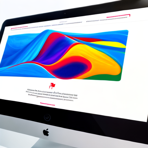
1. The Future | 2021
The Future’s website is a great example of a completely responsive design. The website functions on desktops as well as handheld devices with ease, and its visual appeal is enhanced using smooth animations and videos. The website has a vibrant color scheme which is refreshingly inviting for anyone that visits.

2. The Kit
The Kit app uses a blend of typography, layout, and creative animations to ensure optimal usability. The design is simple but attractive all the while functional, the pink and purple theme give the brand an unapologetic feminine vibe that captures the essence of fashion products.
3. Living With a Star
Living with a Star’s website has a lot of moving parts, but they are all executed seamlessly. It has a grid layout which transitions smoothly from desktop to mobile views, making it feel like a native app. Animations and dynamic graphs add to the atmosphere of the website, making the information presented all the more intriguing to read.
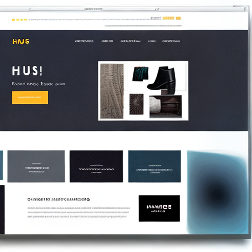
4. Haus
Haus has a simple design that works entirely well for e-commerce. The site features large images with overlay text, which can be easily scaled to any screen size. A unique navigation menu is provided that offers top-line categories, which direct users to detailed product pages.
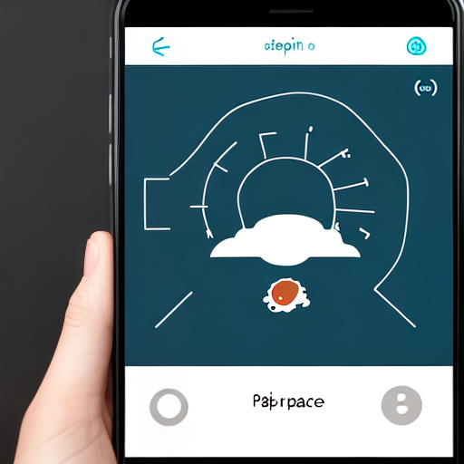
5. Headspace
The Headspace app conforms to all the norms of material design, meaning that the user interface is visually enticing and easy to navigate. The layout is optimized for mobile devices, featuring friendly graphics and motion-based animations to demonstrate guided meditation techniques.
6. Seafolly
The Seafolly design has a touch of everything. The combination of bold typography and pastel colors creates a soothing ambiance, drawing in users to explore the beachwear designs. The brand’s website features a clean layout with a price filter and size selection options, which makes the user experience seamless.

7. Behance
Behance Platform is a treasure trove of award-winning web design projects. The website uses transitions as functional elements, making the user experience more intuitive. The layout is built in a grid, and most of the interface elements are optimized to be interacted with through touch instead of a mouse.
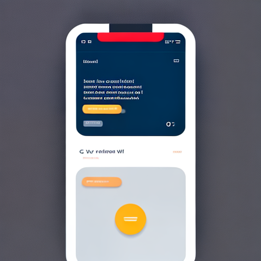
8. Hello Alfred
Hello Alfred’s app allows users to book chores, errands, and deliveries with ease. The app’s design is minimalist, featuring a dominant white background with blue highlight colors. Avatars to identify personal assistants, playful taglines, and helpful icons give the app a friendly personality.
9. Apple
Apple’s website, considered a benchmark in website design, is the epitome of artistic expression with a perfect blend of innovations. The website creates a sensation of delicacy and sophistication, and its layout can be smoothly scaled from desktop to mobile without losing the rich user experience.
10. Tendril
Tendril studio’s website features a trippy-lively geometric interface. The website features smooth transitions, an immersive visual experience, and a sense of freedom, challenging conventional design concepts.

In conclusion, these ten examples of responsive design case studies showcase the creativity and functionality of modern web design. No matter the industry, branding, or concept, art and technology combined bring life to responsive designs.
